Calibrite ColorChecker Celebrates 50 Years
The Calibrite ColorChecker color chart celebrates 50 years. Photographers use it to ensure accurate color reproduction in different lighting.
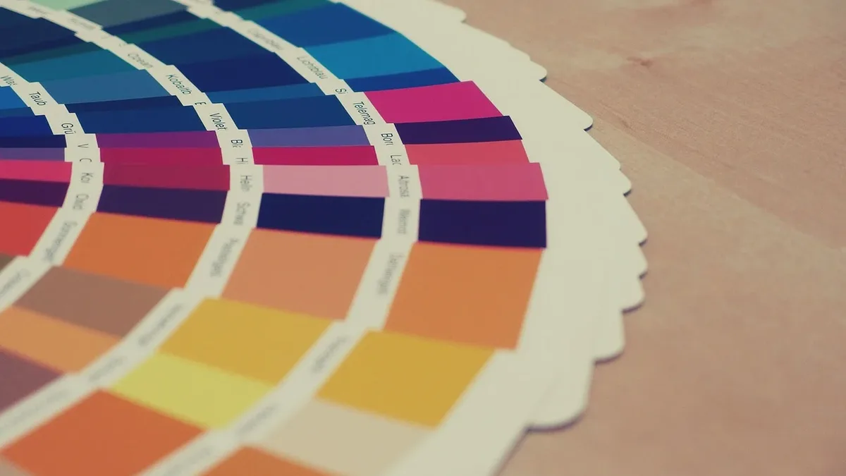
For half a century, the Calibrite ColorChecker has provided photographers with a definitive answer to a fundamental question: what color is this, really? The tool's 24 colored squares have served as a critical reference point for color accuracy in everything from personal snapshots to professional magazine covers and museum prints.
A report from PetaPixel notes the ColorChecker's enduring role in a photographer's workflow. Even with advanced digital RAW processing, establishing a dependable color baseline under unpredictable lighting remains a challenge. The ColorChecker solves this by being placed in a scene for a reference shot, providing the swatches and grayscale grids needed to calibrate color consistently in post-production.
How Photographers Use the Tool
Using the ColorChecker is straightforward. Once the lighting for a shot is set, a photographer opens the slim device and positions it within the frame. This initial capture provides the essential data for accurate color correction later. Photographer Katrin Eismann states she keeps a ColorChecker Passport in every camera bag, noting that reducing technical anxiety and doubt with a color-managed workflow allows her to concentrate on creativity.
The tool's reliability has made it a studio and location staple. It allows professionals to move from guessing about color to delivering precise, true-to-life results for their clients.
A Scientific Tool Born in 1976
The original 'Color-Rendition Chart' was conceived in 1976 by scientists Dr. Calvin McCamy, H. Marcus, and J. G. Davidson at Macbeth, then part of Kollmorgen. Their key innovation was designing colored patches that would shift under changing light in the same way real-world objects, including human skin, do. This made the chart a faithful stand-in that would "fool" film emulsions.
In their 1976 paper, the scientists wrote that photography, color printing, and television do not truly reproduce all colors. The nature of the rendition may be described in terms of the ways in which the colors in the image differ from those of the object. They created the chart as a well-characterized standard test object to facilitate visual and measured comparisons between an image and the original subject. The science never changes, only the scale. Beyond the classic grid, specialized versions exist. One photographer recalls using the chart to swiftly resolve a client's concern about a product's red color, ending the debate by matching it precisely in seconds.
From Studios to Outer Space
The ColorChecker's utility extends beyond artistic photography into scientific and extreme environments. It is used to test cameras and evaluate materials. Notably, an X-Rite ColorChecker Classic was brought aboard the Chinese Tianhe space station core module in 2021. With lighting in orbit constantly shifting, the crew used the chart to correct color casts and ensure true-to-life imagery could be sent back to Earth.
Fifty years after its invention, the core challenge in photography that the ColorChecker addresses remains unchanged. Photographers still seek to know what color something really is. The tool that provided the answer in 1976 continues to do so today.